1. Mast Head and Fonts of Music Magazine
My music magazine has different forms of conventions of real music magazines, like the double page spread has an interview inspired by Vogue magazine and their language and forms of register. The contents page and front cover also has an inspiration from Vogue, Elle and other classic and sophisticated magazine. One reason why I got my inspiration from Vogue and why I did my music magazine in a similar and inspired look is because, from my questionnaire and research is that most people within my target audience prefer to buy fashion looking magazines. Therefore, I would make the magazine look like a fashion and vogue style but have the contents of a music magazine. This will make sure that the audience is kept interested in reading the magazine.
For my masthead I used the font of 'Palantino Linotype'. The reason why I choose the typography used throughout my magazine in the front cover, double page and contents page was because it was all an inspiration from Vogue and their classy and sophisticated look. I used the light blue colour on my mast head because the models eyes are blue and the whole colour scale would go very well together. To compliment the blue I also used a bright pink to contrast with the blue, and then also a white colour just to balance out the colours where it needed toning down. The other puffs and buzz words which is on the front cover are also influential from Vogue and Elle magazine.
The double page spread and contents page has some very elegant fonts and colours. For example in the contents page I have the name of my magazine in a more handwritten twenties style this font is called ‘Gabriola’ and seems to really work together with the layout and the colours in the contents page, which are (black and red). These ideas are all inspired by some more fashion and classy looking magazines rather than rock magazines itself.
2. Mise-en-scene/Background
I have chosen to have most of my photos done in a studio with a backdrop and or a close up so that only the face is seen. I wanted this because it looks like the magazine has done this photo shoot with the celebrity and therefore makes the magazine seem more respectful towards all the celebrities. I also did this because it again looks classier than having a paparazzi looking photo of the model (singer).
(Here are two photos done by the same model but one in a photo studio with lights. The other outside taken by a paparazzi on the red carpet. I think that the outcome of a photo with a backdrop (when thinking about a magazine) looks better.)
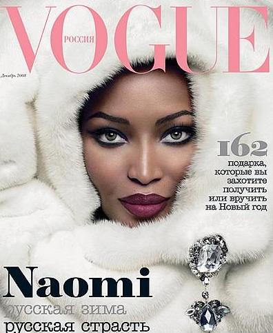
3. Costumes and Props
The only props I used where a red guitar. I also used different costumes for different photos and shoots. I wanted the magazine to have a hint of fashion in mixed with music therefore I used some very dramatic fashion pieces and thoughts when doing my shoots. I took some costume inspiration from Vogue and the front cover of Naomi, I relly liked the furry idea. So to make the photo my own I only took a fur hoddie jacket but shot the photo is a similar close-up. Also to add and link with the music feel I used a red guitar a prop to my magazine.
4. People
I only have one model in my magazine with the front cover, double page spread and contents page. The reason for this is because I want each issue to be like a tribute and honour towards them. However the whole magazine would not only consist of one model if it was made with all pages. Therefore each magazine will have to be thought of the artists and bands that are in at that time. This is also something that Vogue has, they have the same model or celebrity on the front cover as the double page spread.
5. Title Fonts and Styles
I made my titles in 'inDesign' but just having the normal text font. The reason for this is because I wanted the fonts to look classy, sophisticated and formal. If seen in Vogue or Elle, where I found my inspiration from, they have a very simple font, which seems to be the reason why it looks so elegant. I have taken some ideas of conventions and put them into my music magazine like the fonts and size. However, for example the word drop seen in the colum is not added to my magazine- and the reason for this is because I felt that, that word would take some of the attraction away from the photo and the rest of the layout.

(This is my inspiration for my double page spread discourse structure, graphology and typography.)
6. Written Content
The written content of my magazine follows the codes and conventions of a real music magazine by covering similar topics. For example, I have done an interview with the same kind of chatty, yet formal mode of register and tone with added pull quotes in with the text to allow the audience to her the singers’ voice. The mode of address has been specified and considered, so it would suit and target the main audience. However, it does have a quite wide lexis and grammar so that not only the ideal niche audience will be able to enjoy and read the magazine- but so that others can as well.
7. Music Genre and How Your Magazine Suggest It
The genre of my music magazine is pop. It is quite formal and the codes and contentions are mostly seen through the photos and the language used. E.g. the puff on the front cover says ‘classics’ this could be a wide variety or music. But the photo is not a very rocky, punk, indie or rap style. Also the double page spread has a quite friendly and toned down style to it, this may be something that ‘Vibe’ or ‘magazine would consider and include.
These are all conventions that I have dried to portray through my magazine shows and represent the music genre of the magazine (which is pop). Again I have taken the ideas from other types of magazines, such as fashion and put and transformed them into the music magazine.
8. Layout
The layout of my magazine is mainly conventional. This is highlighted on the double page spread which displays an interview in columns beneath a stand first and title. In addition to this, the graphology and discourse structure is similar to magazines, like the photo is on only one side of the double page spread with columns, pull quote and a title on the other. The front cover consists of buzz words, puff text, a barcode, cost and masthead. This is in a similar layout as most magazines. However, to make the layout my own I did not use a word drop in my column for example and obviously the camera shot, angles, costumes and colour scheme are not the same.
9. Contents Page
My contents page contains elements that follow the codes and conventions of existing music magazines. In the beginning of this project I tried to analyse how different contents pages in different magazine looked like to make mine look as good and contents like as possible. I decided to not have an editorials letter, not on the contents page- this is because I wanted the free space that I could have to be left. Therefore if this magazine would be made there would be another page for this letter to be placed. However, despite this the contents page include the date of the monthly issue, the cover stories has an individual column and the other feature are also listed. The page number I choose to have ain a different font from the title of the categories and the text, just to make it a more formal and I believe it would make it look better. I choose to make some words and the category titles in red to make them stand out, and it would make it easier for the reader/ audience to follow. The photos are again, linked with the cover artist and the singer that would be represented within that issue.


